Wednesday

Bird's dialogues

Last month I presented the way I create age layouts, and now it's time to show how I figure out the dialogue.
In this particular project, once I came up with the idea of the Mystery bird, I already knew how this story would end. So, the only thing left for me was to work my way trough the end and build up a logical narrative that would lead to it.
Everytime I came up with an idea about what's going to happen, the constant question was "How is this helping the story?" If I couldn't find the answer, then I'd let go that idea.
But this rarely happened. Most of the time, the question was posed and then I tried to answer it.

What will make the reader realise that the main character is detached from the others?


How can I make them see that she has trouble comunicating with the others?


What will make them feel her growing interest for that mystery?


I hope, I gave the right answers. That is for you to say.

After that, it's the easier part. Well, at least in some ways easier.
The dialogue I put also in service to the above strivings. Especially for "Bird" I tried to put as little dialogue as possible. Somewhere around the begining of the second chapter, I got a bit paranoid that this "less conversation" plan is going to make the story difficult to follow, so I may have let go of my original idea.
This is point that it gets a bit confusing. I really wasn't sure if I should follow more conventional way of telling the story, or should I dive into dream sequences and go and cut off all the dialogue. Certainly, both ways have their charm, but I couldn't decide between them, so I guess this is sort of a low point in "Bird". It's neither conventional, nor art. Something inbetween. In this line of thought, this might be a good thing, since the character herself is a misfit of a sort.
Or I'm, of course, overinterpreting.

Anyway, I spent some time dealing with the words themselfs. For previous comics, the first version of the dialogue was always in english, but in order to make it sound more real and much more rich, I decided to write in my native language. Then, I would transtale it to english and french ( tough one!) and try to make it sound as good as in it's original version.

Here is a little preview of what my dialogue sheets look like when I'm done with them.


You would think there'll be more crossed out stuff.

So, the last thing I do is distribute the lines to pages and then to panels. But I'm really not always sticking to the exact words. Sometimes, in the process of lettering a better sounding version pops in my head, or the speech bubbles are too small and I have to rethink it.
I don't know if this is good or bad practice. Those dialogues are obviously not of Shakespearian type.

But anyway, I try to give my best.

Friday

In colours vol 3

Here are In colours volumes One and Two

Finally managed to get those done.
Have to say those was harder than the previous ones, maybe due to the lack of time or the lack of will to finish them. But the good thing is I got to try out some tricks with the lines and colours
Tried to keep things simple with this one. It's supposed to be thriller, but finally it came out more like a retro b-movie poster.

Maybe there are too many lines, it should've been more poster-like, less detail on her face and stuff, but I figure, It's a good piece anyway.
Here's the thumbnail of this version:

Next is the so called "romance", but I'm not sure what it is actually. Anyway, I pretty much enjoyed working my way trough a picture without lines, and it turned out pretty good, considering my previous experience with this style.


Still not sure how much detail I should leave on her face.

The last one of my cover's experiment is "action"

It's more of a disaster movie poster, I guess.

The building was a bitch to draw, but I rather see it as a success. Lot of things here aren't right, there isn't much of a connection between the background and the character, not to mention my lack of interest in finding a better suiting font, but all in all, it's Ok, I guess. It looks rather well as a thumbnail, so it works.

I might get back to those three later, but for now I'm going to start working on Chapter Three - The Finale.

Upcoming - A page update tomorrow, more wips and a look into how I figure out the dialogue of "Bird".

Wednesday

All thumbs

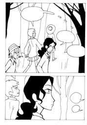
Here are some sneak peaks at the production of Bird. The pages start off as thumbnails which help me to figure out the layout of the page. Then, if I like it I put them to actual size sketches and ink them. Here's what the thumbnail version and the final version of the pages look like compared.


One page, actually page 4 of Chapter Two was actually inked and already had lettering when I decided to drop it and make another.

Version 1

Version 2


Currenntly at page 10, Chapter Two is coming to an end by Christmas, but till then I'm working on more variations of Bird covers. Version romance, action and thriller coming hopefully next week!

Monday

And then there were none

It's been a though fifth week, sicne I'm preocupied with other projects with scary deadlines.

This week, I freaked out at Amilova when the number of competing comics dropped from 107 to 96. It's because of the updating two pages a week rule. Luckily I have few pages in advance, so Bird is being regularly updated every Monday and Friday.

I'm kind of puzzled who I'm gonna vote for, though. Because most of the comics I supported (most of them non-manga) were at the end of the line, and half of them already dropped of the comeptition, cause of lack of updates. I really hope the lack of updates aren't due to lack of votes, cause it would be very discouraging for me ( even if they qualified Bird as manga at Amilova).
Are the non-manga comics at Amilova competition (and everywhere) dissappearing due to the predominate manga interest?

This week two of the disqualified comics, were two of my favourites.

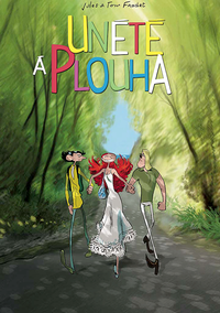
Un été à Plouha ( A Summer in Plouha)
I love the looks of this comic. Wonderful charac
ter deformations, this style just stuck out and made an impression on me. I can't comment on the story, since it was just begining, but I must say I like the characters, especially enjoyed the guys meeting.
I really can't explain why this comic was stuck at the bottom (around 90th place), maybe lack of promotion? It shouldn't be like that. It has wonderful qualitites, it looks much more pro than other works I've seen on the site.
I don't know why the author couldn't keep up with the 2 pages rule ( which is a tricky one, if you doesn't have pages in advance), but I really hope it's not because he didn't get much votes or something. That would be so unfair. For what it's worth, I always voted for Un été à Plouha, I hope the author keeps updating.


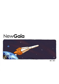
At first, it impressed me with the nice colours. Even if I don't like stories about the future or the outer space, I decided to give it a try.
It starts with a bit too much text, but it was needed I guess. I really loved the part when the alarm started beeping. It just dragged me into the action. And then everything went black&white. It was just the blood that was red. I was really impressed by that.
That's why I was really suprised to see this one at number 61 the first week.
Since then, there were very few updates, I'm guessing the author had other business, but still I voted for it, for that great black&white scene.


Few days ago the author of another comic I really enjoyed (La bande des losers et Dieu) said that he's not gonna pressure himself with 2 pages a week, doesn't want to rush trough his work, cause he's not getting enough attention anyway.
I really hope he sticks around though. He'll have my vote, anyway.

In colours vol 2

Had some spare time and tried out some covers in different genres. Tried out some different colouring styles and realised I have a lot to learn about colour. But I'm catching up on that right after I'm done with all the pages of Bird.

Here are my experiments with genre and colour*:
horror
fantasy
comedy

*You can find the black and white versions in the gallery.

Next week or whenev I find time, I'm gonna do another three versions: romance, action and thriller. Stay tuned.

Added banners for Amilova nd the comic Mink, located at the bottom of the page. Also did some Bird banners. How do you find them?

One month has passed since the begining of the Amilova.com competition. "Bird" is at # 53 (of 104) this week, with 93 votes. Thank you very much. 53rd place might look like no big deal, but thinking about the almost 100 persons who like my comic makes me happy. Thank you!
Keep up the high spirit!


Sunday

In colours

Lately I've been thinking to add some colour to the Bird cover ( you see it on the right ), just to see how it works. I think the b&w version is good as it is, but I gave it a try.


So far, it's the blue one that got the votes, but I'm still not sure. I might as well try a whole new one.

Meanwhile: Added a gallery ( under the header) with some character development pics. To be updated. Also, working on a few banners, to spread the word :)


Thursday

Mystery bird presents itself...

... as an idea.
For some time I had this very vague story in my mind about a little girl who is desperate to catch a glimpse of a ghostly bird that only appears at night. But there wasn't really anything I could do with this. Lots of things were missing.
Like, where does this bird presents itself?

I almost gave up on that story, thinking about other projects, when suddenly, things came to their places. I had a trip to London, and of course Greenwich was a place I wanted to visit. It was an early spring afternoon, still a bit chilly, but the trees were all green and the air was fresh. Walking trough Greenwich park, all I could think about was my story and that this is a perfect setting for it.

I especially loved the Royal Observatory South building.


So, the minute I found myself in front of a white sheet of paper I began working on my revived project.
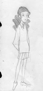
Here is the earliest version of the character, based on one of my chatacters from a previous project.